 how-to
Style Shelves for a Cohesive Look: A Step-by-Step Guide
Table of Contents
- Why Cohesive Shelf Styling Matters
- Understanding Shelf Styling Rules That Work
- Balancing Visual Weight on Shelves
- Choosing a Shelf Styling Color Palette
- Selecting the Best Decor Items for Shelves
- Layering and Negative Space for Depth
- Styling Shelves for Your Space: Budget-Friendly Hacks
- Conclusion
- Frequently Asked Questions
Last Updated: September 4, 2026
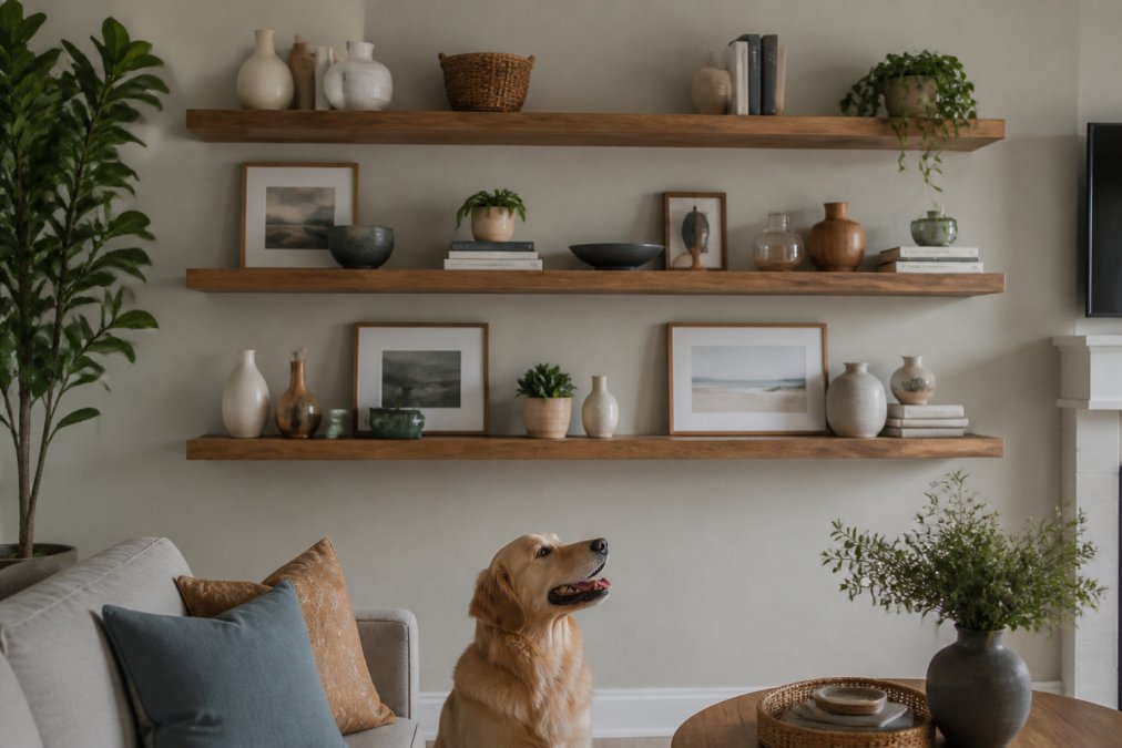
Empty shelves are a design opportunity most people waste. You stare at the built-ins, buy a few random objects, and end up with a scattered display. Styling shelves for a cohesive look is less about buying more decor and more about applying a few repeatable rules that designers use every time. At Station Home Design, we believe a well-styled shelf should feel collected over time, not decorated in an afternoon. Below, we'll show you exactly how to group, layer, and balance your objects so your shelves look pulled together.

The secret is that cohesive shelf styling is a visual formula, not a talent. Once you understand how the eye moves across a surface, you can apply the same principles to any shelf. Let's walk through the method.
Why Cohesive Shelf Styling Matters
A styled shelf anchors the entire room, giving the eye a resting place and signaling thoughtful composition. Random shelves make even beautiful furniture feel unfinished.
Cohesive shelf styling is the practice of arranging objects so they read as one intentional composition rather than separate items. The goal is a curated look that feels calm, not cluttered. This matters because our brains register visual chaos subconsciously; a balanced arrangement makes a room feel more restful and inviting. According to interior design research on visual perception, people perceive spaces with organized, balanced displays as more welcoming and comfortable.
Understanding Shelf Styling Rules That Work
You don't need an art degree to style a shelf well, just a few rules that govern how objects relate to each other in size, color, and placement.
The Rule of Thirds and Visual Balance
Divide your shelf into three mental sections. Aim for about one-third of the shelf to hold larger anchor pieces, one-third to hold medium-height objects, and the final third to hold smaller accents and negative space. This prevents the common mistake of cramming everything into the center or lining items up like soldiers.
Visual balance doesn't mean symmetry, it means the overall weight on the left side feels similar to the right. A tall bookend can be balanced by a stack of books and a low plant on the other side.
Grouping by Size and Shape
Grouping is the single most effective trick for instant cohesion. Cluster objects in odd numbers, typically threes, a trio of ceramic vases in varying heights, or two books stacked horizontally with a sculpture on top, to create a vignette that reads as intentional.
Odd numbers force the eye to keep moving; even numbers feel static. Vary heights and shapes within each cluster so the silhouette is interesting, not flat.
Balancing Visual Weight on Shelves
Visual weight is the perceived heaviness based on size, color, and texture. A large dark urn carries more weight than a small light candle. Distribute heavy and light elements so no area feels overloaded.
Asymmetrical Arrangement Techniques
Asymmetrical balance, where different objects of equal visual weight sit on opposite sides, feels more modern and lived-in than symmetry.
Think of each shelf as a seesaw: counter a heavy, dark object on the left with a lighter but visually larger object, like a trailing plant or stack of light books, on the right.
Creating Focal Points Without Clutter
Every well-styled shelf needs one focal point, a piece of art, sculpture, or striking book cover. Style everything else around it, keeping surrounding objects lower or smaller so they support rather than compete.
Clutter happens when every object tries to be the focal point. Edit ruthlessly: if an item doesn't add to the composition, remove it. Style with a few strong pieces and allow the eye to rest.
Choosing a Shelf Styling Color Palette
A cohesive color palette is the fastest way to make mismatched objects look related. Choose two to three main colors and stick to them; tones should harmonize, not match exactly.
Pull accent colors from your rug, artwork, or upholstery and repeat them on the shelf. If your room has warm wood tones and olive green accents, choose decor in cream, terracotta, and natural wood.
Arrange books by color to create an intentional gradient. Keep a photo of your palette on your phone while shopping to avoid jarring colors. A neutral base with a few carefully chosen colorful accents reads more sophisticated than a rainbow of hues.
Selecting the Best Decor Items for Shelves
The best decor items tell a story about you while following rules of scale and proportion. Mix personal items like travel souvenirs or family photos with sculptural pieces like ceramics, vases, and art books.
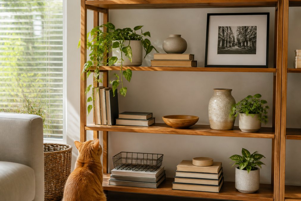
Mix materials to add depth: wood, metal, ceramic, and natural fibers like rattan. Texture keeps the eye engaged even with a minimal color palette.
Books: Horizontal vs. Vertical Stacking
How you stack books changes the entire feel. Horizontal stacking adds a visual break and creates a platform for smaller objects, while vertical stacking is the default.
Mix both methods: place two or three horizontal stacks to anchor vignettes, and let vertical books fill remaining space. This adds rhythm and prevents a library-archive look.
Adding Greenery and Texture
Plants add life, color, and organic texture. A trailing pothos softens hard edges; a tall snake plant adds height and drama. Use pots that match your color palette.
Woven baskets, matte ceramics, and chunky knits add tactile interest. Mixing matte and natural textures makes a shelf feel warm; all glossy objects feel cold.
Layering and Negative Space for Depth
Layering transforms a flat display into a dimensional scene. Negative space, the empty area around objects, is just as important as the objects themselves and creates visual rhythm.
How Layering Creates Depth
Layering works by breaking the plane of the shelf. Create multiple planes of depth: foreground, middle ground, and background.
Foreground: Place smaller or lower objects at the very front edge of the shelf. These act as entry points for the eye.
Middle ground: Position medium-height objects and clusters slightly back, creating a second visual layer.
Background: Lean artwork, mirrors, or a tall sculptural piece against the back wall. This creates a visual "wall" that contains the composition and prevents it from feeling like objects floating in space.
Overlap signals depth: let a trailing plant drape in front of a photo, lean a book against a vase, position a small object in front of a larger one. The shelf suddenly feels three-dimensional.
If you're styling a shelf with a visible back wall, always use it. Lean or hang something there; an empty back wall makes even a well-composed foreground feel incomplete.
The Psychology and Mechanics of Negative Space
Negative space is essential to how the eye processes a composition. Crammed objects trigger visual noise and stress; spacing them out allows the eye to rest and makes the composition feel calm and intentional.
The "20 to 30 percent empty" rule is based on how the eye naturally scans a surface (apa.org). When roughly one-quarter to one-third of a shelf is empty, the brain processes each object individually rather than lumping everything as "clutter." Five well-spaced objects feel more sophisticated than fifteen crowded ones.
Negative space creates hierarchy: objects surrounded by empty space feel more important. Give your focal point more breathing room than surrounding objects.
Practical Layering Techniques
Lean, don't hang: Lean framed art against the back wall at a slight angle for a casual, collected feel and easy adjustments.
Stack horizontally and vertically: Combine horizontal stacks (which create platforms for smaller objects) with vertical stacks (which add height) for natural layers.
Use height variation within clusters: Vary heights by at least 2-3 inches. A tall vase, medium candle, and low ceramic piece create a more interesting silhouette than similar heights.
Let plants drape: A trailing pothos or string of pearls naturally creates layering as it spills over the edge or in front of other objects, adding movement.
Create a "back row" and "front row": Place taller objects or visual anchors (art, mirrors, tall plants) in the back, and smaller objects in the front. This prevents a flat look and ensures nothing gets lost.
Balancing Fullness and Breathing Room
A well-styled shelf feels about 60-70 percent full and 30-40 percent empty. This ratio prevents both the claustrophobic "everything crammed in" look and the sparse "barely anything here" look.
Step back and squint at your shelf. If objects blur into a visual mass, you need more space. If each object reads clearly and your eye moves comfortably from one to the next, you've found the balance.
Styling Shelves for Your Space: Budget-Friendly Hacks
You don't need to spend a fortune to achieve a designer look. Work with what you already own, then strategically fill gaps with thrifted or repurposed pieces. This forces intentionality.
Shop Your House First
Before you buy anything, audit every room. Move a ceramic pitcher from the kitchen, pull art books from the bedroom, borrow a basket from the closet. This surfaces forgotten items (which feel fresh in a new context) and reveals what's missing from your palette.
Thrift Strategically for Shape and Texture, Not Purpose
Thrift stores are goldmines if you know what to hunt for. Skip generic items and look for distinctive silhouettes or tactile surfaces: a ceramic pitcher with unusual glaze, a wooden bowl with interesting grain, a brass candlestick with patina, or an asymmetrical glass vase. These work across color palettes because their interest comes from shape and material, not color.
Ignore original function: a vintage pitcher becomes a sculptural vase, a wooden box becomes a catchall, a brass measuring cup becomes an accent. This mindset finds pieces at a fraction of retail cost.
Solving Architectural Constraints Without Extra Spending
For shallow shelves (less than 8 inches deep), use vertical layering. Lean framed art or a mirror against the back wall; use only low-profile objects in front. A single tall item often reads better than multiple small objects clustered together.
For deep shelves (12 inches or more), pull everything forward to the front third, then use the back third as a visual backdrop. Lean art or a mirror against the back wall to create enclosure and prevent a storage-unit feel.
For corner shelving units, place a tall object (plant, books, or sculpture) directly in the corner to anchor it and prevent wasted space.
The Power of Repetition on a Budget
Repeat a single affordable item in different sizes or finishes to create cohesion. Three glass vases in varying heights read as intentional when grouped. Repetition signals design intent; the eye reads it as "chosen," not "random."
Lighting: The Budget Hack That Changes Everything
Lighting is the most underutilized budget tool in shelf styling. A small, battery-operated puck light placed behind a vignette draws the eye to your focal point and adds a warm glow. Warm-white LEDs feel more inviting than cool white and work with nearly any palette.
A single light on the most important shelf creates visual hierarchy and makes the lit display feel like the "hero" of the wall. Accent lighting can make displayed objects appear significantly more valuable to the viewer.
Conclusion
Styling shelves comes down to a few repeatable choices: group in odd numbers, balance visual weight, edit your color palette, and leave room to breathe. Removing a few items does more than adding new ones.
Building a cohesive home is a process, and the right furniture gives you a strong foundation. Station Home Design offers pieces like the Jane 71 Inch Tall Arched Natural Rattan Bookshelf which brings sculptural texture to a living room, or the Transmit 45" Four-Tier Bookcase with Sliding Doors for a mix of open display and concealed storage. Our curated collection blends comfort, elegance, and everyday functionality to support your design vision. As noted by design psychology experts, surrounding yourself with a thoughtfully arranged space can positively affect your mood and sense of well-being. Get started with Station Home Design and turn your shelves into a true reflection of your story.


Frequently Asked Questions
What is the rule of three in shelf styling?
The rule of three is a foundational principle in styling shelves for a cohesive look. It suggests grouping objects in sets of three to create visual interest and balance. Odd numbers feel more natural and less rigid than even groupings. You might display three books stacked horizontally, three small sculptures, or three potted plants at varying heights. This principle works because it creates a rhythm that feels intentional and curated rather than random or cluttered.
How do I balance visual weight on shelves without making them look empty?
Visual weight refers to how heavy or prominent an object appears. Balance it by mixing larger statement pieces with smaller accessories and negative space. Place a tall decorative object on one shelf, then balance it with a cluster of smaller items on another level. Avoid filling every inch of shelf space, negative space is your friend and actually makes displays look more intentional. Think of it as strategic breathing room that lets each piece shine.
What shelf styling color palette works best for a cohesive look?
Choose a color palette of three to five colors that complement your room's existing decor. Stick to one dominant neutral (white, gray, or natural wood tones) and add two to three accent colors through books, plants, and decorative objects. This restraint creates cohesion. Warm palettes (creams, golds, terracottas) feel inviting, while cool palettes (blues, grays, greens) feel calming. The key is repetition, use your chosen colors across multiple shelves so the eye moves smoothly through the display.
How do I style shelves if I'm renting or can't commit to a permanent design?
Renting doesn't mean you can't create a cohesive, stylish display. Focus on portable, affordable pieces like books, small plants, framed prints, and lightweight decorative objects that you can take with you. Station Home Design offers versatile pieces like the Transmit bookcases that work in any space and adapt to your evolving style. Avoid permanent installations and keep your color palette simple so pieces work across different rooms and future homes.
This article was written using GrandRanker
Frequently Asked Questions
What is the rule of three in shelf styling?
The rule of three is a foundational principle in styling shelves for a cohesive look. It suggests grouping objects in sets of three to create visual interest and balance. Odd numbers feel more natural and less rigid than even groupings. You might display three books stacked horizontally, three small sculptures, or three potted plants at varying heights. This principle works because it creates a rhythm that feels intentional and curated rather than random or cluttered.
How do I balance visual weight on shelves without making them look empty?
Visual weight refers to how heavy or prominent an object appears. Balance it by mixing larger statement pieces with smaller accessories and negative space. Place a tall decorative object on one shelf, then balance it with a cluster of smaller items on another level. Avoid filling every inch of shelf space—negative space is your friend and actually makes displays look more intentional. Think of it as strategic breathing room that lets each piece shine.
What shelf styling color palette works best for a cohesive look?
Choose a color palette of three to five colors that complement your room's existing decor. Stick to one dominant neutral (white, gray, or natural wood tones) and add two to three accent colors through books, plants, and decorative objects. This restraint creates cohesion. Warm palettes (creams, golds, terracottas) feel inviting, while cool palettes (blues, grays, greens) feel calming. The key is repetition—use your chosen colors across multiple shelves so the eye moves smoothly through the display.
How do I style shelves if I'm renting or can't commit to a permanent design?
Renting doesn't mean you can't create a cohesive, stylish display. Focus on portable, affordable pieces like books, small plants, framed prints, and lightweight decorative objects that you can take with you. Station Home Design offers versatile pieces like the Transmit bookcases that work in any space and adapt to your evolving style. Avoid permanent installations and keep your color palette simple so pieces work across different rooms and future homes.