
 ultimate-guide
How to Build a Cohesive Home Palette: A 2026 Guide
Table of Contents
- Why a Cohesive Home Palette Matters
- Start With a Neutral Base
- Understanding the Color Wheel and Visual Harmony
- The 60-30-10 Color Rule Examples for Your Home
- How to Choose Paint Colors for Open Floor Plans
- Tips for Balancing Warm and Cool Tones
- Digital Tools and Finding Inspiration
- Building Your Palette on a Budget
- Frequently Asked Questions
Last Updated: September 2, 2026
Why a Cohesive Home Palette Matters
A cohesive home palette is the invisible thread that ties your entire living space together, transforming a collection of rooms into a unified home. Without it, you end up with mismatched colors that feel jarring and disconnected spaces that don't flow.
Here's what most people get wrong: they think cohesion means everything has to match. It doesn't. A cohesive home palette actually gives you freedom to be creative while maintaining visual harmony. Think of it as a musical composition where different instruments play different notes but still create a beautiful song together.
When you establish a thoughtful color flow across your home, your eye moves smoothly from room to room, guests comment that your space feels intentional, and you actually enjoy spending time in every corner instead of cringing at the color choices in the hallway.
At Station Home Design, we believe that building a cohesive home palette doesn't require expensive consultants or years of design training. It requires a framework, some intention, and a willingness to think about color as a design tool rather than a decorative afterthought.
Start With a Neutral Base
Every strong cohesive home palette begins with a neutral foundation. This isn't about painting everything beige and calling it a day. A neutral base is a strategic choice that anchors your entire design and gives you the flexibility to layer in secondary and accent colors without overwhelming your space.
The neutral base typically covers 60% of your visual space, think walls, large furniture pieces, and flooring. This is your breathing room, where your eye rests. Without it, even a well-planned color scheme can feel chaotic.
Choosing undertones that work throughout your home
Here's where most people stumble: they pick a neutral color without considering undertones. A neutral with warm undertones (creamy whites, warm grays, soft taupes) creates a completely different feeling than a cool neutral (crisp whites, cool grays, soft blues). Mixing them throughout your home creates visual discord.
Warm undertones feel inviting and cozy, working beautifully in living rooms and bedrooms. Common warm neutrals include ivory, cream, warm gray, greige, and soft taupe.
Cool undertones feel fresh and sophisticated, working well in kitchens and modern spaces. Common cool neutrals include white, cool gray, and pale gray-blue.
The key decision: pick one undertone family and stick with it throughout your main living areas. You don't have to use the exact same neutral in every room, variation in saturation and depth creates visual interest, but maintaining consistent undertones prevents that jarring "wrong color" feeling when you move between spaces.
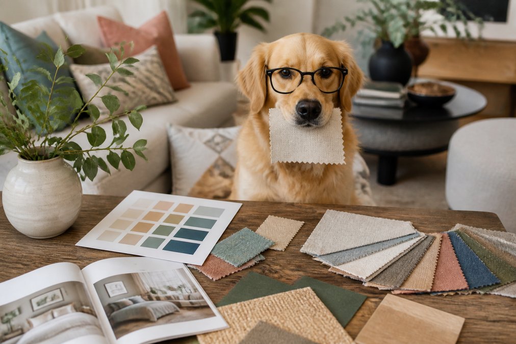
A practical test: take paint swatches of your chosen neutrals and hold them next to each other in different lighting conditions. Natural light, artificial light, and evening light will all reveal whether your undertones are working together or fighting each other.
The American Society of Interior Designers emphasizes that undertone consistency is one of the foundational principles of cohesive interior design.

Understanding the Color Wheel and Visual Harmony
The color wheel isn't just a tool for artists, it's your map for building a cohesive home palette. Understanding how colors relate to each other gives you confidence to make intentional choices rather than random ones.
Analogous hues sit next to each other on the color wheel (blue, blue-green, and green). They naturally harmonize because they share similar undertones and saturation levels, creating calm, unified spaces perfect for flow across your home.
Complementary colors sit opposite each other on the wheel (blue and orange, red and green, yellow and purple). They create visual excitement and balance. When used strategically, one as dominant and the other as accent, they add energy without chaos.
Triadic schemes use three colors equally spaced around the wheel. These are bolder and require careful balance, but they create stunning, dynamic palettes when executed well.
Most cohesive home palettes rely heavily on analogous relationships because they're naturally harmonious. You pick your primary color family (soft blues), then add analogous neighbors (soft greens, cool grays) to create visual flow. This is why so many successful palettes feel effortlessly put together, they're following the color wheel's natural logic.
The 60-30-10 Color Rule Examples for Your Home
The 60-30-10 rule creates instant balance in any space: 60% dominant color (typically your neutral base), 30% secondary color (supporting hue), and 10% accent colors (pops of personality).
Applied to a cohesive home palette, this rule becomes your structural blueprint across your entire home.
In a living room: 60% neutral walls and large sofa, 30% secondary color through accent chairs and window treatments, 10% bright accent colors through pillows and artwork.
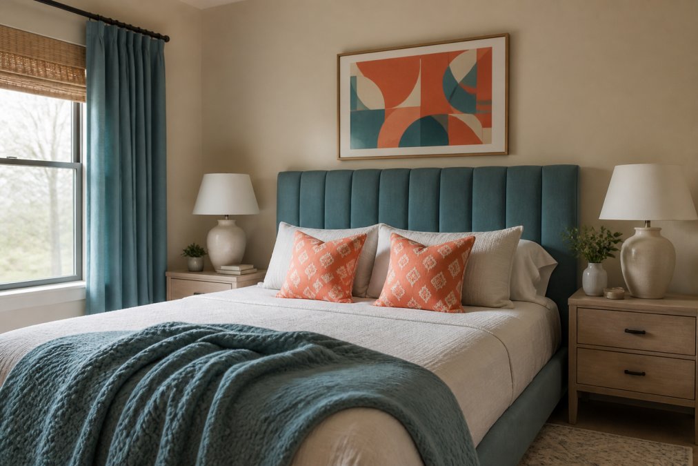
In a bedroom: 60% neutral walls and bedding, 30% secondary color through curtains and upholstered headboard, 10% accent colors through artwork and throw pillows.
In a kitchen: 60% neutral cabinetry or walls, 30% secondary color through countertops or a feature wall, 10% accent colors through hardware and bar stools.
When you apply this rule consistently across rooms, maintaining your 60% neutral base throughout, using the same secondary color family across spaces, and coordinating your 10% accents, you create a cohesive home palette that feels intentional and balanced.
The Morales - Nightstand - Rustic Oak is a perfect example of how a well-chosen neutral piece serves as your 60% anchor, grounding a bedroom while leaving room for secondary and accent colors to shine.

How to Choose Paint Colors for Open Floor Plans
Open floor plans present a unique challenge: how do you create separate visual zones without walls to define them? The answer is understanding color flow and spatial continuity.
You're not trying to hide that spaces connect; you're making those connections feel intentional. Your color transitions need to feel like a deliberate design choice rather than an accident.
Creating color flow and spatial continuity
Use color progression rather than abrupt changes. Instead of jumping to a completely different color family, transition through analogous hues or varying saturation levels of the same family.
Example progression: Cool gray in the entryway → soft blue-gray in the living room → soft blue in the kitchen → cool white in the dining area. Each space has its own identity while remaining visually connected.
Another powerful technique is using the same neutral base throughout while changing secondary colors by zone. Your 60% neutral stays consistent across the open plan, but the 30% secondary color shifts slightly to define different functional areas.
Lighting conditions matter enormously in open floor plans. Natural light from different windows hits different zones at different times of day, so colors shift throughout the day. Test your paint colors at different times and under different lighting conditions.
The National Kitchen and Bath Association recommends that color transitions in open-concept spaces should feel like a natural progression rather than a sudden shift.
Consider using a light color in smaller zones and slightly deeper versions in larger spaces. This prevents smaller areas from feeling cramped while maintaining cohesion.
Tips for Balancing Warm and Cool Tones
Most homes benefit from a balance of warm and cool tones rather than being exclusively one or the other. This tension creates visual interest and prevents your space from feeling one-dimensional.
Warm tones (reds, oranges, yellows, warm neutrals) feel inviting and energetic. Cool tones (blues, greens, purples, cool neutrals) feel calm and sophisticated. The magic happens when you intentionally weave both into your cohesive home palette.
Establish your primary undertone through your neutral base, then layer in secondary colors from the opposite temperature family. If your neutrals are warm (creamy, taupe-based), introduce cool accent colors through artwork and textiles. If your neutrals are cool (gray-blue, crisp white), warm wood tones or warm metallic accents create balance.
Metallic finishes are underrated tools for temperature balance. Warm metals (brass, copper, gold) enhance warm palettes, while cool metals (silver, chrome, brushed nickel) enhance cool palettes. Mixing metals intentionally, a brass fixture in a cool-toned room or silver accents in a warm space, creates sophisticated visual tension.
Textiles are your secret weapon for temperature balance. Linen, wool, and cotton naturally carry warmth. When choosing fabrics for your cohesive home palette, consider how their inherent temperature will interact with your wall colors and larger pieces.
Digital Tools and Finding Inspiration
Building a cohesive home palette has never been easier thanks to digital tools that let you visualize color combinations before committing to paint or purchases.
Using apps and paint swatches to test your palette
Start with digital inspiration. Pinterest, Instagram, and design platforms let you collect images that resonate with you, then analyze their color palettes. Many platforms have built-in color extraction tools that pull exact colors from photos, incredibly useful for identifying which colors are making a space feel cohesive.
Paint manufacturers now offer excellent digital tools. Most major brands have apps where you can upload photos of your room and virtually paint walls with different colors. This is genuinely useful for seeing how a color looks in your specific lighting conditions and with your actual furniture.
The American Paint Association notes that digital color visualization tools have become increasingly accurate, though they still don't replace physical swatches in real lighting.
Here's the workflow that works: find digital inspiration → extract color palettes from images you love → order physical paint swatches → test swatches on your walls for 3-5 days in different lighting → make your final decision. Digital tools are great for exploration, but physical swatches in your actual space are non-negotiable.
When testing swatches, paint large areas (at least 2-3 feet square) and observe them at different times of day. Morning, afternoon, and evening light will reveal whether a color truly works in your space.
Station Home Design's carefully curated pieces, like the Gray Loveseat or the Bash - Sofa With 7 Pillows - Macca Anthology Boucle are designed to work with many color palettes. These versatile neutral and soft-toned pieces serve as anchors that let you explore secondary and accent colors without worrying about clashing.

Building Your Palette on a Budget
You don't need unlimited funds to create a cohesive home palette. Strategic choices about what to invest in and where to save make all the difference.
Invest in your neutral base. Paint is affordable, and getting your wall colors right sets the foundation for everything else. Spend time and money here, test multiple colors, and get it right the first time.
Save on accent pieces. Throw pillows, artwork, and decorative objects are where you can experiment with secondary and accent colors without major expense. These items are easier to swap out if your tastes change.
Invest in key furniture pieces that anchor each room. A quality sofa, bed frame, or dresser in a neutral tone becomes the foundation of that room's color story. The Morales - Dresser - Rustic Oak or the Morales - Nightstand - Rustic Oak are examples of pieces worth investing in because they'll work with multiple color palettes over time.

Save on trendy colors. Use your secondary and accent colors for items you can change relatively easily. Paint a feature wall in a bold secondary color, but save your neutral investment for larger wall areas.
Mix high and low. You don't need every piece to be high-end. A mix of investment pieces and budget-friendly finds creates a more interesting, authentic palette than trying to match everything perfectly at one price point.
Think about your cohesive home palette as an investment in your daily life. The money you spend getting the foundation right pays dividends every single day in how much you enjoy your space.
Building a cohesive home palette transforms your home from a collection of rooms into a unified space that feels intentional and welcoming. The framework is simple: establish a neutral base with consistent undertones, understand color relationships through the color wheel, apply the 60-30-10 rule consistently, and balance warm and cool tones throughout. Station Home Design's curated collection of timeless pieces, from the rustic warmth of the Morales collection to the sophisticated comfort of the Gray Loveseat, provides the neutral anchors you need to build your palette with confidence. Start with your foundation, test your colors in real light, and let your cohesive home palette evolve into a space that truly reflects who you are.
Frequently Asked Questions
Q: What is the 60-30-10 rule for creating a color palette?
A: The 60-30-10 rule is a design principle that allocates your primary neutral color to 60% of your space, a secondary color to 30%, and an accent color to just 10%. This creates visual balance and prevents overwhelming color saturation. For example, 60% soft beige walls, 30% gray upholstery, and 10% warm gold accents. This framework works across your entire cohesive home palette, ensuring color harmony from room to room.
Q: How many colors should be in a whole-house color palette?
A: Most designers recommend limiting a whole-house palette to 3-5 core colors plus neutrals. This prevents visual chaos and maintains color flow throughout your home. Stick to one dominant neutral base, one or two secondary colors, and one or two accent colors. This constraint forces intentional choices and makes it easier to select furniture, paint, and decor that support your overall design consistency without feeling monotonous.
Q: What are the best neutral colors for a cohesive home palette?
A: Warm neutrals like greige, warm gray, and soft taupe create inviting spaces, while cool neutrals like dove gray and soft white offer contemporary vibes. Choose a neutral base that reflects your home's lighting conditions and undertones. Rustic oak pieces like the [Morales - Nightstand - Rustic Oak](https://stationhomedesign.com/products/morales-nightstand-rustic-oak) work beautifully with warm neutrals, anchoring your palette with natural wood tones. Test paint swatches in different rooms and lighting before committing, as undertones shift dramatically throughout the day.
Q: How do I choose a base color for my entire home?
A: Your base color should reflect your home's natural lighting, your personal style, and the undertones you want throughout. Consider your home's architectural features, wood trim, flooring, and existing fixtures influence which undertones work best. Look for inspiration in fabrics, artwork, or items you already love. Test paint samples on large swatches in multiple rooms and observe them at different times of day. Your base color sets the foundation for all accent colors and design consistency across your home.
Q: How do you transition colors between rooms for a cohesive look?
A: Maintain your neutral base color throughout or use analogous hues from the color wheel for smooth transitions. In open floor plans, keep the dominant color consistent and vary secondary and accent colors subtly. Use tint, shade, and tone variations of your core colors to create visual interest while preserving color harmony. Textiles, trim, and ceiling colors can shift slightly between rooms while staying within your palette's undertone family, creating spatial continuity without jarring color changes.
Q: What is the psychology of color in open-concept living?
A: In open layouts, your eye travels across all visible colors simultaneously, so cohesion becomes critical. Warm undertones create intimacy and energy, while cool undertones feel spacious and calm. Excessive color variation reads as chaotic; subtle shifts within your chosen family feel intentional. Open-concept spaces benefit from a strong neutral base that anchors the entire area, with accent colors used strategically to define zones without breaking visual flow. This psychological consistency reduces mental fatigue and makes your home feel intentionally designed.
This article was written using GrandRanker
Frequently Asked Questions
Q: What is the 60-30-10 rule for creating a color palette?
A: The 60-30-10 rule is a design principle that allocates your primary neutral color to 60% of your space, a secondary color to 30%, and an accent color to just 10%. This creates visual balance and prevents overwhelming color saturation. For example, 60% soft beige walls, 30% gray upholstery, and 10% warm gold accents. This framework works across your entire cohesive home palette, ensuring color harmony from room to room.
Q: How many colors should be in a whole-house color palette?
A: Most designers recommend limiting a whole-house palette to 3-5 core colors plus neutrals. This prevents visual chaos and maintains color flow throughout your home. Stick to one dominant neutral base, one or two secondary colors, and one or two accent colors. This constraint forces intentional choices and makes it easier to select furniture, paint, and decor that support your overall design consistency without feeling monotonous.
Q: What are the best neutral colors for a cohesive home palette?
A: Warm neutrals like greige, warm gray, and soft taupe create inviting spaces, while cool neutrals like dove gray and soft white offer contemporary vibes. Choose a neutral base that reflects your home's lighting conditions and undertones. Rustic oak pieces like the [Morales - Nightstand - Rustic Oak](https://stationhomedesign.com/products/morales-nightstand-rustic-oak) work beautifully with warm neutrals, anchoring your palette with natural wood tones. Test paint swatches in different rooms and lighting before committing, as undertones shift dramatically throughout the day.
Q: How do I choose a base color for my entire home?
A: Your base color should reflect your home's natural lighting, your personal style, and the undertones you want throughout. Consider your home's architectural features—wood trim, flooring, and existing fixtures influence which undertones work best. Look for inspiration in fabrics, artwork, or items you already love. Test paint samples on large swatches in multiple rooms and observe them at different times of day. Your base color sets the foundation for all accent colors and design consistency across your home.
Q: How do you transition colors between rooms for a cohesive look?
A: Maintain your neutral base color throughout or use analogous hues from the color wheel for smooth transitions. In open floor plans, keep the dominant color consistent and vary secondary and accent colors subtly. Use tint, shade, and tone variations of your core colors to create visual interest while preserving color harmony. Textiles, trim, and ceiling colors can shift slightly between rooms while staying within your palette's undertone family, creating spatial continuity without jarring color changes.
Q: What is the psychology of color in open-concept living?
A: In open layouts, your eye travels across all visible colors simultaneously, so cohesion becomes critical. Warm undertones create intimacy and energy, while cool undertones feel spacious and calm. Excessive color variation reads as chaotic; subtle shifts within your chosen family feel intentional. Open-concept spaces benefit from a strong neutral base that anchors the entire area, with accent colors used strategically to define zones without breaking visual flow. This psychological consistency reduces mental fatigue and makes your home feel intentionally designed.